Buttons and Links - commonly misunderstood

Exploring the Maze
In the world of website accessibility there is a recurring challenge that stands out—the misunderstandings surrounding buttons and links.
Unfortunately this issue is something I encounter frequently in my line of work as I navigate through web audits during my testing process.
Buttons, which are designed to trigger actions or events, like submitting a form or opening a dialog box are elements according to the World Wide Web Consortium (W3C).
They play a role in user interactions.
However problems arise when buttons that visually appear as such are coded as links or vice versa.
Although it may seem like an inconsistency its impact on users— those with unique needs—can be significant.
The Dance of Differentiation; How Coded Buttons and Links Disrupt User Experience
In the dance between buttons and links differentiation is key.
Buttons are specifically designed for actions providing users with a path to submit forms or initiate events.
On the hand links usually guide users to pages or resources on websites.
When these elements are coded incorrectly it disrupts the flow of navigation and usability.
This disruption has an effect, on accessibility.
This brings me to a situation I often come across during my web audits.
There are picture buttons that look like buttons and have a design and purpose.
However upon examination they are often coded as links
This not goes against the expected functionality.
Also causes confusion, for users who rely on assistive technologies.
Real Life Challenges; Ionas Journey with Misaligned Buttons and Links
Now let me share an example that emphasizes the importance of this issue.
Allow me to introduce you to Iona, a member of my testing team.
Iona faces difficulties.
Depends on Dragon dictation to interact with her computer.
Using voice commands such as "click link" or "click button " Iona navigates through web pages.
The problem arises when Iona comes across buttons that visually appear as buttons but are actually coded as links.
When she says "Click Button " none of the buttons get highlighted, leaving her uncertain whether the problem lies with Dragon or the website itself.
To add complexity to matters the seen Search icon, often coded as a button may be the button, on a page.
So when Iona says "Click Button " it automatically selects the search box making her experience more challenging.
The toll, on Iona becomes apparent when she realizes that buttons that look like buttons are not coded as buttons.
She adapts by saying "Click Link," which triggers the appearance of numbered links or buttons that she can select.
Although this process may seem brief the lack of consistency across websites means it repeats frequently during audits leading to exhaustion for users like Iona.
A Refreshingly Simple Solution; Following Visual Cues
The solution to this problem is simple—follow cues.
If something looks like a button it should be coded as a button.
While buttons and links have functions their visual presentation is crucial for user understanding.
Web designers often style links to resemble buttons for reasons.
In cases aligning the code with the appearance ensures a seamless and inclusive experience for all users.
To conclude the integration of buttons and links in web design requires precision.
Misalignments in coding create obstacles for users those who rely on technologies.
By embracing an approach that reflects the indicators when coding buttons and links we not only enhance accessibility but also contribute to a more harmonious online experience, for everyone.
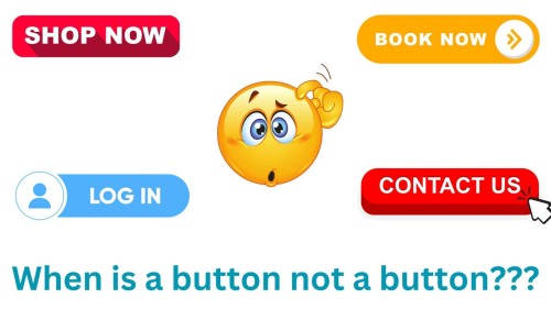
Caption: Check out these four buttons on our website; Shop Now Book Now Log In and Contact Us. They're cleverly placed around a cartoon of a face scratching its head.
We've got a question, for you; When is a button not a button?
If you're curious to learn more why not have a chat with us about an web audit?
Our team at Access by Design / Access, by Audit specializes in creating WCAG 2.2 compliant and beautifully designed websites.. We provide disabled accessibility testing as part of each web audit.
Find out how we can make your website more inclusive!
