Accessibility overlays don't work!
What Is an Accessibility Overlay?
This is one of the most confusing areas of website accessibility — and also one of the most important. An overlay can either improve your site or make it completely inaccessible. That is the heart of the confusion.
So, what exactly is an accessibility overlay? Let us start by defining a regular overlay first.
What Is an Overlay?
An overlay is an element that sits on top of the existing web page, allowing new content to be displayed without changing the page beneath it.
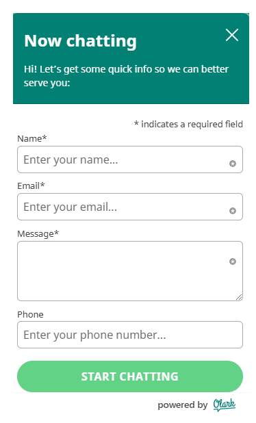
A common example is a chat widget — usually found in the bottom right corner of the screen. You will often see a speech bubble icon and text like “Chat with us”.

Clicking the widget opens a small form asking for your name, email address, and enquiry. Once filled in, you start chatting with the business — all without leaving the page. That is an overlay. You can close it and return to the page behind it.
Other Overlay Examples
Shopping baskets are often overlays too. Clicking the basket icon brings up a panel — without leaving the product page. Contact forms might pop up in a similar way.
These overlays are popular because they reduce visual clutter and improve the user experience. But the problem is how they are coded. Many are simply not usable by disabled people.
This is why overlays have such a bad name in accessibility circles — they are often inaccessible by default.

That said — they do not have to be.
Can an Overlay Be Accessible?
Yes. On our own website, the chatbot is accessible. It is powered by Olark, a company that has made accessibility a priority.
It is possible to build overlays that are fully accessible — it just takes care, testing, and a bit more time.
What Is a Web Accessibility Overlay?
Now that we understand overlays, let us talk about accessibility overlays specifically.
These are tools that claim to make your website accessible through a floating toolbar or icon. They let users change things like:
Text size
Foreground and background colours
Remove styling altogether
They are often marketed as quick fixes. Drop in a snippet of code, and your site is magically compliant.
Where Did This Idea Come From?
The idea behind this is not new. WCAG has included guidance on user control over visual presentation since 1999 — it is WCAG 2.2 AAA level (1.4.8). This is above the AA level most organisations aim for, which is why many developers ignore it.
But these options — like changing text size and colour contrast — have always been easy to add with a bit of CSS and JavaScript.
We have included them since our very first website in 2006.
The Crucial Difference
There is a major difference between:
An accessibility toolbar that is part of your website’s native code, and
A toolbar that comes from a third-party overlay provider, sitting on top of your site
They might look similar, but they behave very differently.
Third-party overlays often make your site less accessible, especially for screen reader users. They interfere with native HTML and sometimes override important accessibility settings.
Yet they are marketed as compliance solutions. Drop in the code, and tick the box — job done.
Let me be clear: they do not make your website compliant.
For more, visit overlayfactsheet.com
Our Approach: Native Accessibility Toolbar
On our website, we have an accessibility toolbar called Accessible View. It sits next to the navigation menu.
It lets you:
Increase text size
Change colours
Remove styling

It is our own code, not a third-party product. It is not perfect, and we are always improving it, but it is tested by our team — all of whom are disabled users. That matters.
And no — you do not need this toolbar to be WCAG 2.2 AA compliant. But we believe in offering it, because inclusive design gives people choice.
Why Expecting Users to Adjust Settings Is Not Enough
You could argue that people can adjust text size or colours using browser controls. But here is the problem:
Many users do not know how
Some people cannot physically use those shortcuts
For example, Iona, one of our team members, has a hand disability and cannot press two keys at once.
Sara, who is neurodivergent, uses a dark mode browser plugin to avoid headaches from bright backgrounds. But these plugins often break parts of the page or hide content.
Accessible design means giving people options on your site — not expecting them to manage everything themselves.
In Conclusion
✅ Overlays can be accessible
❌ Accessibility overlays can be a problem
🚫 Third-party accessibility overlays usually are a problem
So yes — I may need to change the title of this article!
Clive Loseby
Global Leader in Website Accessibility, TED Speaker
