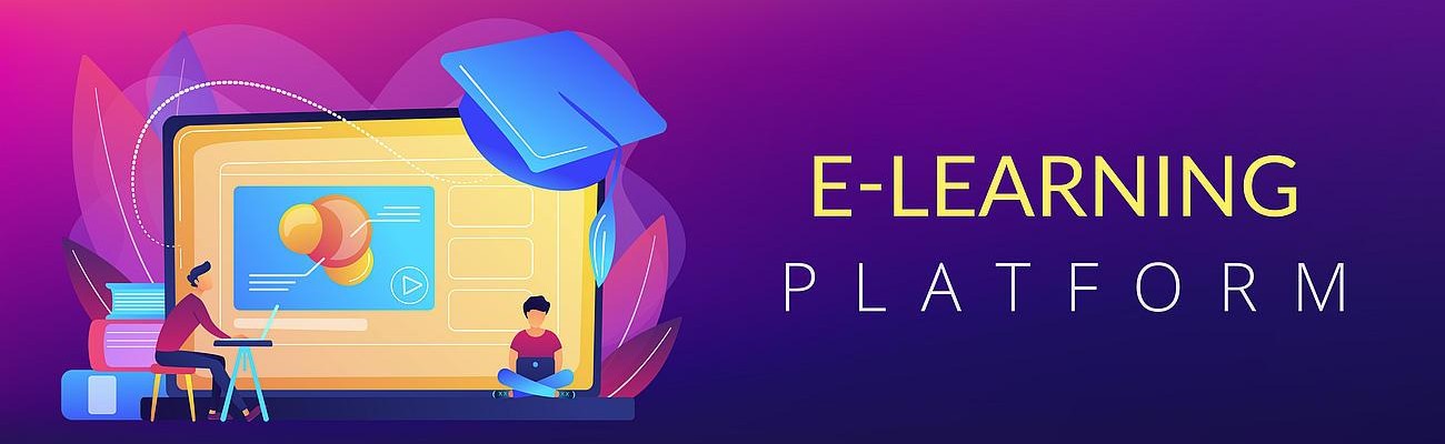
Online Learning Platform web audit

Learning platforms do not follow the conventions
We recently were asked to perform an web audit on an online learning platform. These platforms are usually accessed through a web portal and require an account to log in. The platforms, of course, fall under the Equality Act, just like a regular website, and they often present their own sets of challenges.
Learning platforms are usually simplistic in design, and it would be reasonable to assume that there could be far less that could cause accessibility problems. Unfortunately, this is not usually the case and often it is more challenging. The reason for this is because a website has to follow certain basic rules that pretty much all web designers follow, but with a portal, it is possible to create something freely.
The Learning Platform itself had no colour contrast options. This meant that the white background that it had would be particularly tiring for neurodivergent users. There were no options to change the text size either.
The online courses looked very straightforward. They consisted of a series of slides similar to what you may come across in a PowerPoint presentation.
If you could not use a mouse, you were in trouble!
The first slide was the Course Objectives, broken down into three areas. This was represented by 3 boxes with text in each one. They were each covered up with a graphic containing the numbers 1,2 and 3 respectively. You must click on each one in turn, to reveal the text box behind it. There was a Next button which took you onto the next slide but it was greyed out. It did not become active until all 3 boxes had been clicked on in turn and the text revealed.
This was all very nice but there was a minor problem. It was not possible to select any of the images with a keyboard, a screen reader or with dictation software. That meant that it was not possible to read any of the Course Objectives. The Next button remained greyed out and it was not possible to take this online course or any of the others, without being able to use a mouse.
Throughout the actual course itself, this type of design continued: there would be a series of images displayed, and you would have to select each one, in turn, to confirm you had understood the point it was covering. Once they had all been selected, you were then able to move on to the next slide.
Unlike the first slide, all of these images were at least keyboard accessible. It was possible to use the tab key to navigate to each one in turn and select the image by pressing the enter key. One some of the slides, selecting images resulted in a big green tick appearing over the image. When all 6 images were ticked, you could go to the next slide. Unfortunately, there was no accompanying audio signal or message to indicate that a green tick had appeared. Additionally, this green tick was created using an overlay, which was not picked up by the screen reader.
We found an alternative solution!
Although it was clear that the way the course was presented was not accessible for disabled people without extensive recoding, we were able to resolve this difficult situation in two ways. We were able to suggest ways in which disabled people would be able to take these courses without actually using this portal specifically and we wrote an accessibility statement that explained what the challenges were and offered alternative ways for disabled people to have access to the same courses in a way that was appropriate from them.
These alternative methods were actually quite inexpensive to create and it enabled our client to be able to reach out to disabled people and ensure they would feel included.
Often it is not about what you are able to put right, it is more about your willingness to work with what you have and go out of your way to help people.
A web audit and an accessibility statement, performed correctly, will help create wonderful opportunities to help disabled users feel inclusive and valued, regardless of the accessibility challenges present in the portal or other software.
Would you like to find out more?
If you are interested in a free initial review of the accessibility of your website, why not book yourself in for a consultation? Please follow this link to do so. It will open in the same browser.
https://calendly.com/cliveloseby/accessibility-audit-free-initial-consultation
Access by Design
Delivering an Outstanding web audit every time.