Imitation: A Flattering Approach to Web Accessibility

Navigating through the digital landscape has become an integral part of our daily lives, and ensuring that this virtual realm is accessible to all is a responsibility that often falls by the wayside. However, my recent experience with the Scottish Parliament in developing their MSP Expenses Tool presented a refreshing departure from the norm. In this instance, accessibility took centre stage right from the project's inception, marking a rare and positive departure from the usual course.
The Unusual Path of Accessibility
Traditionally, accessibility tends to be an afterthought in web development, pushed to the back burner due to perceived costs. The prevailing misconception is that integrating accessibility from the start might be an expensive endeavour. But is this cost truly prohibitive when compared to the expenses incurred in rectifying an inaccessible website after the fact? I'd be hard-pressed to find an example where the latter approach proves more economical.
Unveiling the Diversity of Accessibility Toolbars
Consider the realm of accessibility toolbars, often designed by third-party products that promise solutions but frequently introduce more problems than they solve. However, it's crucial to recognize that not all accessibility toolbars are created equal.
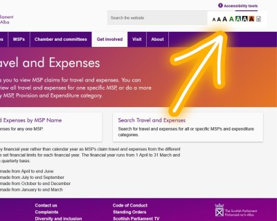
In the case of the Scottish Parliament's Expenses Tool, the delightful revelation was that our own accessibility toolbar was seamlessly integrated. This is no small feat, as our toolbar is designed to be an integral part of the website's underlying code, sidestepping the complications associated with third-party solutions.
"Imitation is the Sincerest Form of Flattery"
Upon pointing out this integration, I was met with the reminder that "imitation is the greatest form of flattery." Our toolbar, seen as an exemplar of best practices, had found a new home in the digital corridors of the Scottish Parliament's online realm. This development sparks anticipation – will this integration extend to the entirety of the website in the future? Could it possibly become a beacon adopted by other UK Parliaments?
More Than One Way to Change the World, One Website at a Time
Observing the potential ripple effect, it becomes evident that there's more than one way to catalyse positive change in the digital sphere. By incorporating accessible design principles and tools, even a single website can set in motion a wave of influence. The integration of our accessibility toolbar into the Scottish Parliament's Expenses Tool not only signifies a triumph for inclusive web design but also hints at a broader transformation in the making.
As we keep a watchful eye on the developments unfolding in the Scottish Parliament's digital landscape, the prospect of our accessibility toolkit influencing other parliamentary websites offers a testament to the power of collective efforts in shaping a more accessible and inclusive online world. After all, change can start with a single website and resonate far beyond, demonstrating that the impact of thoughtful design reaches every corner of the virtual realm.
