Navigating the Challenges of Inconsistent Links
Clive Loseby on December 8, 2023 at 1:39pm |Updated on February 26, 2024 at 1:25pm
Introduction
In the dynamic landscape of website accessibility, a recent audit conducted for an NHS Health Trust revealed a commendable standard overall. However, as our team delved deeper, we unearthed a common stumbling block: inconsistency, particularly in link behaviour. This discrepancy not only poses challenges for disabled individuals but also impacts the user experience for everyone. Let's dissect this issue and understand why consistency in link design matters.
Unveiling Inconsistency
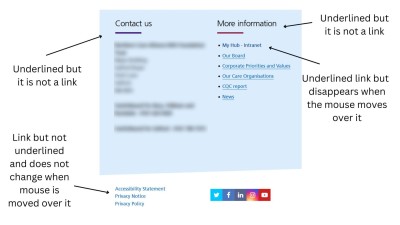
A prevalent issue identified in the audit was the inconsistency in link behaviour. Traditionally, links are underlined to signify their clickable nature. However, the audit revealed instances where words like "Contact" and "More" were underlined but lacked the expected link functionality. On the contrary, links on the right-hand side displayed the underlining, which disappeared upon mouse hover, and a faint box appeared when tabbed through with a keyboard.
At the bottom left, three links stood unadorned—devoid of underlining and resistant to visual changes upon mouse interaction. Again, a faint box emerged when tabbed through, signaling an active link. This inconsistency in link presentation can sow confusion among visitors, a concern that extends beyond the disabled community.
The Significance of Consistency
Consistency in link design is not merely an aesthetic consideration; it plays a pivotal role in enhancing user experience for all visitors. When links behave disparately, it can be disconcerting, especially for individuals who are neurodivergent. The visual cues associated with standard link behaviour—underlining or visual changes on interaction—serve as navigational aids for users across the spectrum of abilities.
In the presented audit scenario, the contrasting behaviours of links within the same webpage create an environment where visitors may struggle to discern clickable elements. This challenge extends to individuals with disabilities, but it also impacts the broader user base, fostering an atmosphere of uncertainty.
Practical Recommendations
To mitigate these challenges, a commitment to simplicity and consistency in link design is imperative. Websites should adhere to established conventions, ensuring that links are uniformly presented. Whether through underlining or visual changes in interaction, the key lies in offering predictable cues to users about the interactive nature of the elements.
Moreover, web developers and designers must be cognizant of the diverse user base, including those with neurodivergent needs. By prioritizing a consistent approach to link design, the online environment becomes more inclusive and user-friendly for everyone.
Conclusion
In the ever-evolving landscape of website accessibility, addressing the issue of inconsistent links is paramount. The recent audit for an NHS Health Trust sheds light on the prevalence of this challenge and underscores the importance of rectifying it. By embracing simplicity and uniformity in link design, websites can create an environment where all visitors, regardless of ability, can navigate seamlessly and confidently. In the pursuit of an inclusive digital space, the journey begins with recognizing and rectifying the intricacies of link behaviour.
